This is not as easy as it sounds.
I’ve know for a few months that one of my goals for 2014 was “updating my Profile Picture.” My current one will be ten years old in late August. So, channelling my inner Ann Landers (the syndicated newspaper columnist I followed from about age nine), I set out to update the photo.
There are a number of decisions to be made in the course of completing this suspiciously simple goal:
- Professional shot or candid?
- Long shot or close-up?
- Hair up or down?
- Make-up (I never wear it) or no?
- Winter background or Summer?
See what I mean?
Each of these questions, by the way, is quite easy to put off for another day, week, even month. However, I find I’ve actually worked my way through the list, seemingly unaware.
1. I decided early on to NOT go with a professional picture. This was a financial decision. Enough money has been washed down the drain of late. So, beginning sometime in early March, I began asking different folks to take photos of me.
2. My husband took some while the snow still covered the ground (was that in April?). Here’s the only one with enough pixels to be included: We’ll call this one A
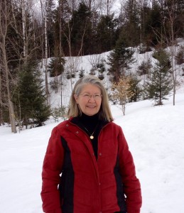
It’s what I’d call a long shot and I can zoom in and make it more of a head shot (A2).
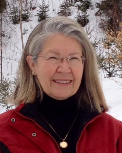
I thought the closer head shot would work better. So that answered that question.
Still, I wasn’t sold. I seemed to be squinting, and given I’d worn the glasses that DON’T turn into sunglasses in the glare, I probably was.
Recently, Woody’s niece Melody, hubby Chris, and 6-month-old Holly came for a weekend and I got lucky. Melody is a fantastic artist in her own right (See her website at Melody Starkweather Portraiture for examples of her work) and she has a great eye for setting up a shot.
3. I’d been experimenting with wearing my hair down for the past few months — to the extent of setting it in rollers now and again! — just to get ready for this picture. But, on the day Melody and I set out to snap some photos, the hair was up. And there it stayed.
4. I quick grabbed a lipstick, but that was it.
Four of my five questions were answered! Close-up, hair down up, candid (more or less), no make-up (well, maybe a little lipstick). I still had the summer vs. winter question, but I was obviousy leaning heavily toward the yet unseen “summer” (it was technically still spring) ones.
Melody took over 40 shots of me at various stops around the property.
And, as a result, I now have a collection of photos — with the necessary number of pixels, of course — among which is surely my new Profile Picture. Remember, this photo will be repeated on ALL my social media platforms: website, FB, Twitter, Google+, Pinterest, LinkedIn, … The list is endless.
Here then are three summer (aka spring) head shots.
Keep in mind, I’m aiming for a sense of approachability — would someone seeing this picture want to know me better? And, at the same time, will what I say carry some degree of verisimilitude? (You can’t imagine how long I’ve been wanting to use that word in a sentence.)
In other words, do I look professional as well as approachable?
Let’s call these shots B, C, and D.
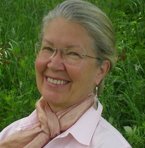
I like B because my eyes don’t squint as much as they do in C and D.
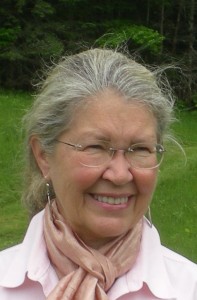
I like C because my hair has gotten wind blown.
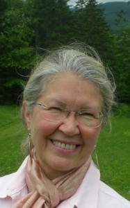
And I like D because it’s a head shot yet still shows my magnificent Vermont mountains in the background.
In all three, I’m wearing earings from Kazakhstan.
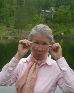
Finally, to remind myself not to take any of this too seriously, I’ll end with this one. I won’t label it.
Oh, what the heck. Let’s call it E.
What’s your choice? A2, B, C, D, or E?
How old is your Profile Picture? Do you remember how you chose it?
What is a pixel? Can you take a picture of one? How many pixels would that picture (of a pixel) then have?
I think I’ll stop now.
Frank Moore
They’re all good pics, but I like B best.But if you’re going for whimsical, E is it.
Janet Givens
Thanks for weighing in, Frank. Stay tuned.
KM Huber
I like B, as it seems to meet all your requirements. Of course, I like E and perhaps you can use it on your About page on your blog. I also think E makes a great shot for Twitter. Although I know how powerful Twitter is or can be, I also think it is a little more whimsical. E is just a great shot! That said, any of them will work. Remember, it is the picture you will see of yourself on all of your sites.
Karen
Janet Givens
Hi Karen, Yes, I’d love to use E somewhere. The About Page is a good idea. Thanks. The other piece I remind myself is that this picture will be up another ten years, too. That’s my plan! (chuckle, chuckle).
Linda Austin
I like B – friendly and approachable, no glasses glare, no squinting, and we can see your earrings better. Hope to see E floating around somewhere, though! I decided to update my profile pic, too, since it was about 7 years old, but don’t have one I like yet. Noticed our local newspaper has been updating its columnist photos – ten years makes a difference! We’re older, wiser, and more beautiful, right?!
Janet Givens
Well put, Linda. Do you remember that old Clariol commercial? “We’re not getting older; we’re getting better.”
Judy Kuster
I like them all, but I will be out voted ‘cuz I choose D.
You are beautiful, Janet
Judy
Janet Givens
Aw, Judy. … Thank you. I’ll strive to receive your compliment in the spirit in which you sent it. (I know you.). What is it about our culture that makes that sometimes so hard?
Kathleen Pooler
Janet, I like them all but B captures your vibrancy the best. It conveys a warm and welcoming presence, like you! I do hope you find a place for the last photo to capture your sense of humor. Priceless! Good luck deciding.
Janet Givens
Hi Kathy.
Yes, I believe it shall be B.
Mikah showed me something on my iPad today called Photo Booth. With it we made all sorts of odd photos. He took one of me with my face twisted 45 degrees, as though it were made of silly putty. Many ways to have fun. Specially in the rain.
Melody
Yes, I think B, which I believe is the one we talked about…I like that we can see your beautiful eyes. Holly likes E.
Thanks for the shout-out! It was wonderful to be able to help! 🙂
Janet Givens
Happy to, Melody. I had my website guru flip B over and that’s what I’ll be posting sometime over the next week. Thanks again
Shirley Hershey Showalter
I join the chorus on B. You look “mahvahlous, darling!” I see your sense of humor in your eyes as much in this picture as in the last one. Thanks for bringing us up to date.
Janet Givens
Shirley, you know you started it! I actually tried to link to your blog about choosing your picture, but wasn’t able to isolate that post from others. But I’m glad to give you lots of credit for planting the “this will make a good blog post” seed. Thank you. And thanks for stopping by in the midst of your travels. I need to get over to your blog soon and relay my cross-country Amtrak story. See you later.
Ronny Herman de Jong
Well, I like C the best, Janet. It is the most natural.
Janet Givens
Hi Ronny. Good to see you again.
Brenda
All great. But I’m in for B and E.
Janet
Thanks. E actually won and served me well for a few years.