
“You can’t judge a book by its cover.” They say (whoever “they” are).
Well, turns out we do it all the time.
As a result, choosing the cover for my book is a critical part of the process.
Turns out many folks will not even pick up the book if the cover doesn’t jump out at them and call, “Pick me; pick me.”
Who knew?
I thought it’d be fun to reminisce a bit with you on my process for choosing the cover for my book,
At Home on the Kazakh Steppe.
And, at the end, I’ll let you tell me which one(s) jump out at you, pleading, “choose me; choose me!”
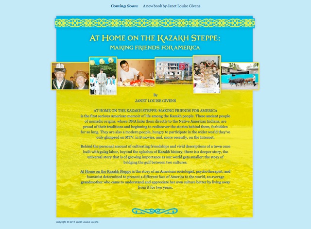
From the start, I was clear I wanted to use the colors of the Kazakhstani flag.

The bright blue is so reminiscent of the ever-blue sky over head. You can tell they love their bright sun and sky.
My website designer, Anne McKinsey, had put together an initial “coming soon” page back when we first began creating my website. While I wound up going with another color combination, I loved how the colors of that site jumped out at me, saying “Here I am.” I thought that would be a good place to start.
So, I went back to Anne, learned she’d love to design my book cover, and fed her some of my photos so she could get to work. Here are the initial evolutions:


I loved each one of these, but for very different reasons. And, when I posted them to one of my Facebook Groups, I got immediate and very helpful feedback.
Still, something felt missing.
So, Anne suggested we do a “photo” display, something like a collection of polaroids, each telling a story. Here is the next batch:
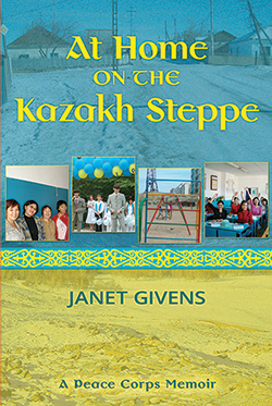
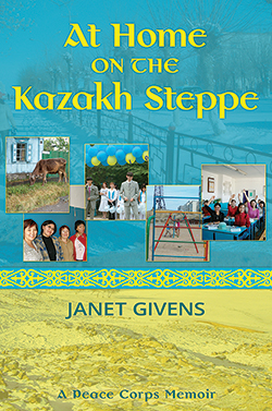
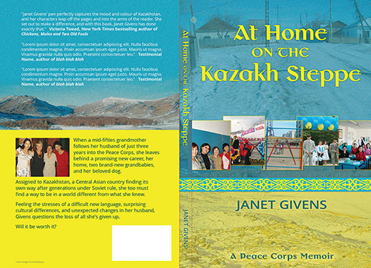
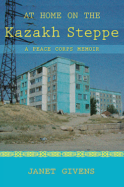
Let’s call these A, B, and C.
C, by the way, shows the full cover, back as well as front.
Each front cover features four or five photos, a single background photo, and a photo of the steppe on the bottom, in yellow. Each one has the same font (an earlier decision) and the subtitle is now at the bottom, as almost an after thought (as it should be). This is NOT a typical Peace Corps memoir (I hope). I feared for awhile it would be prematurely judged as such.
A, has four small photographs, while B and C both have five. One of the small photos in C is different from the set in B. Does this matter to you? If so, what is your preference?
This is beginning to resemble those “find the animals” games that I once shared with my grandchildren! A massive jungle and hidden among the foliage are a dozen or so lions and tigers and bears — oh my!
Oops, I got a little distracted.
The background pictures are different, too. Do you see them? Do you care?
So many other choices, too:
- How many photos (the fewer the photos, the larger they can be)
- What kind of photos (landscapes or faces; bleak or scenic; distant or up close?)
- Do we scatter them or set them in a straight line?
My head began to spin.
Then I learned about noise!
Yes, Noise. Like we once had on our TV screens. Remember? (if you are under 35, you probably don’t).
Turns out we can either have noise, or go with “no noise.”
Two of the photos above have noise; one does not. FYI
UPDATE: We’ve got it down to two! This one is called 5D.

And this one, 9D, which gives a hint as to how many iterations Anne and I have gone through. To coin an old George Burns phrase, “choosing a book cover is not for sissies.”

So, if we DO judge a book by its cover, and (as we all know) a picture is worth a thousand words, (What other cliches am I missing?) these become important questions.
In case you want a clearer view of the earlier snapshots, I’ll be adding the original photos to the slide show on my website’s AT HOME ON THE KAZAKH STEPPE page. Pop on over and take a look.
What do you think?
I hope you’ll weigh in here with your thoughts.
(And, really, thanks for sharing a little of my OCD-ish-ness this week! Sharing does indeed lighten the load).
Frank Moore
Janet, One of the covers clearly stood out for me — the one with the two women. It says this book is about people — interesting people with interesting faces. If the book segments and deleted scenes you’ve posted are indicative of the content, so is this cover.
Janet Givens
Frank, I hear you. I loved that picture too and have given it a new lease on life, partly because of your post. But we’ve lightened it up and simplified the overall look. Stay tuned.
Marian Beaman
My husband and I both like the B choice. Cliff is an artist/illustrator and he comes with reasons: 1. The cover should “read” in thirds–B does. 2. It has less brown/gold dirt(?) in it than A, 3. Choice B included a focal point photo in the middle and one more photo than A..
The back of the dust jacket looks fine. In fact, the colors remind me of those of the Ukrainian flag, sky and grain.
There you have it – 2 agreements in one post! Happy obsessing, Janet!
Janet Givens
Happy obsessing, indeed, Marian. I’ve just returned from spending the afternoon with Anne. I’ll be posting the results of our labors soon. I loved hearing Cliff’s three pointers. And, as it turns out, I think these next two follow those rules. Serendipitously, to be sure.
Nancy McBride
The cover is the gateway, and I agree, you want peoples’ eyes to tell their hands to grab it!
I like B, and the back cover is fine. Whichever pictures you choose should relate to a story and relationship…I am glad you have photos to support your experience.
(It is a dream of mine to build and live in a large, permanent wooden (not yak skin) yurt.) I look forward to reading it!
Janet Givens
Nancy, Hello and welcome. So glad to have you stop and chat. I have a spot up in my woods behind me where I envision a yurt some day. We call it the “yurt site.” And I have a neighbor who is building one, slowly, out of wood. So, you will be in good company. I hope it comes to fruition for you some day. White Mountain Yurts is also a good company, if you want to go the easy route. Good luck; and do keep my posted. I have a very soft spot in my heart for folks who live in yurts.
Sherrey Meyer
Janet, I’m definitely to the two women on the first of the last two covers. Perhaps it’s because I’m a woman, but I prefer to think it’s because I see generational differences in them, perhaps speaking to the range of ages benefiting from Peace Corps efforts. I think their image together speaks very well to relationships, a definite result of your work.
Janet Givens
HI Sherrey, welcome. I too loved the symbolism of that picture. So, I’ve decided, since it didn’t make it to the book cover, to have it framed and hang it in my office. I love the age difference (it’s a mother and daughter). I love the difference in approach to tradition (head scarve and non). I love that one is looking square into the camera and the other is looking off, into the distance (the future?). I love so many things about it. Yes, it will hold a important place in my office, watching over me as I write the next book. Thanks for your observations. They are valuable to me.
Kathleen Pooler
Oh , Janet, who I can relate to this multi-layered process of deciding on a book cover. You have described the process perfectly. My vote goes for 5D for the close and personal feel which draws me into all the amazing experiences and friendships you forged. It’s a promise that we, your readers, will get a fascinating glimpse into another culture and its people. Can’t wait to dig in!
Janet Givens
Hi Kathy. This was such a hard decision for me. And for many of the reasons you just gave for liking 5D. I’m hoping that 9D will also give readers that promise too — why are all the desks painted blue? Why are these young people so happy? What’s going on? Time will tell. (and thanks for the Tweet I just saw) Writing the book was so much easier than picking the cover! 🙂 See you soon
possum
Well, I am sure it is too late to weigh in on this, but my vote would be for B, the one with the cow, since it is a book about so much more than just those 2 faces… and I also like the classroom of kids, but then I am a former teacher, so that might explain that choice.
Having lived in another country, I feel B encompasses a feel for the land as well as the people and also your place in their lives. Just the 2 faces would lead me to expect the book to be about those 2 people.
So it will be interesting to see what you finally chose.